How contrasting print ads from Cartier and Yeo Valley grabbed consumer attention
One takes a minimalist approach while the other is crammed full of text, but both made consumers stop and take note.

Print media can often be overlooked in the digital era, but it remains an effective and sometimes rewarding way to reach consumers.
The latest edition of The Works study from Kantar features an analysis of magazine ads, and highlights two contrasting examples that each illustrate effective use of the medium. Both employ insight into consumers, the magazines used and their readerships, to ensure the titles became part of the message.
“Readers are totally in control of what advertising they consume when reading a magazine and can easily turn the page should an ad not immediately engage with them. Effective creative ideas therefore need to work hard to grab attention and hook readers to maximise a chance of really engaging with the ad and processing it,” says Kantar head of creative excellence Lynne Deason.
Produced in association with Marketing Week and the Advertising Association’s Trust Working Group, The Works study asks 750 consumers what they think of five current print ads – 150 consumers per advert. The study also tracks the facial expressions and eye movements of those viewing the ads.
 Luxury brand Cartier has been identified as the best-performing ad this month, with Deason describing it as, “the clear embodiment of less is more”. It ranks among the top 12% of UK ads on this critical ‘stop and look’ measure.
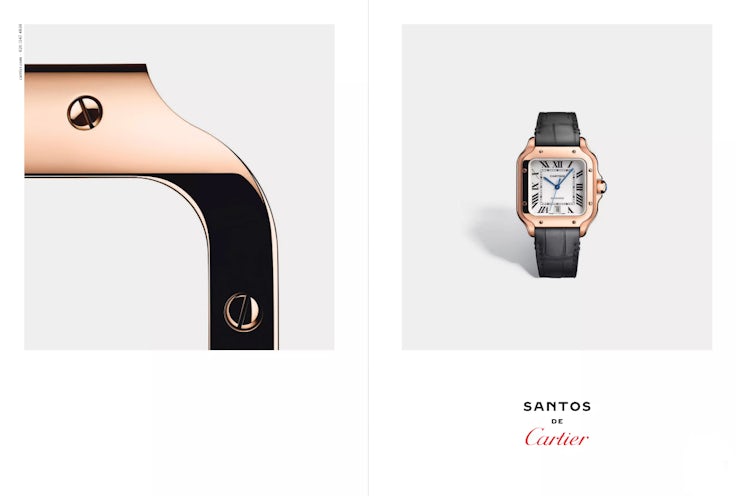
‘Santos de Cartier’ uses a minimalist double page spread (DPS) to let Cartier’s product do the talking. Sumptuous photography, with close-up details of the watch that is being advertised, is surrounded by luxurious amounts of white space, with clear branding.
“There is a low chance of readers turning the page without looking at the ad first,” says Deason.
A sense of distinctiveness, and the way the minimal ad highlights the product, were singled out by the consumer test panel. “The beauty of the watch speaks for itself,” said one. “It’s a picture meaning a thousand words,” said another.
Kantar’s measurement shows the ad falling into the top quartile for the measure of distinctiveness, which plays to the tendency of the human brain to notice things that are different. The ad also ranks as very likeable, again scoring in the top quartile, and interesting – where 31% of consumers ticked the top box against an average of 15%.
Crucially, consumers find it easy to make the connection between the ad and the Cartier brand. The elegant aesthetic used in the ad feels familiar to the brand and is undisturbed by any visual clutter.
Stand out
The second ad to stand out this month shows there is more than one way to skin a cat when it comes to creating compelling magazine ads.
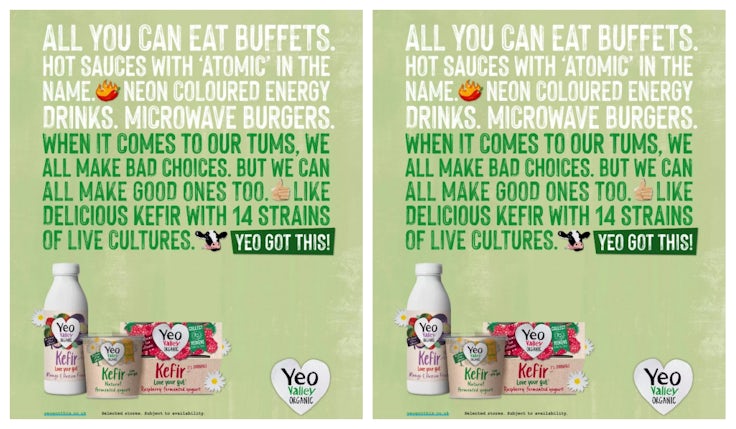
Yeo Valley’s Kefir ad is based around a classic insight – that while many of us want to make healthier choices, this is made difficult by all of the irresistible yet unhealthy options that try to tempt us to do otherwise. The ad takes a lighthearted and empathetic tone, presenting the Kefir products as an easy and pleasurable way to make at least one good decision.
 “While text heavy ads run the risk of low engagement and readers flicking to the next page, this ad uses a combination of bold colour and a provocative, funny list of poor dietary choices to engage readers,” says Deason. “The ad follows this up with the use of the second person – colloquial language and the collective ‘we’ creates more of a direct combination with the reader – which also contributes to capturing interest and places the ad in the top third of all UK ads for engagement.”
It is also another likeable ad, in the top 25% on this scale, and distinctive, placing in the top 15%. The consumer panel were pulled in by the entertaining copy, finding it funny and reading the entire ad, as illustrated by eye tracking data.
“The ad is among the top 25% of best branded print ads tested in the UK and is easily linked to the brand. People are really drawn into the product, but the play on words ‘Yeo got this’ and the similar look and feel with other Yeo ads means it fits intuitively with the Yeo Valley brand,” says Deason.
Print media is effective at conveying numerous and more complex messages than other mediums, because of the way it is more actively consumed, as illustrated in Kantar’s Power of Connection report, adds Deason. She notes that the Yeo Valley ad is a good example of that rule in practice.
“People notice and appreciate the information conveyed about the product, feeling it’s particularly new, highly credible, very different from others and relevant. This drives a more immediate desire to try the product, supporting a more immediate short-term response from this ad,” she says.


Comments